PAKR Mobile App
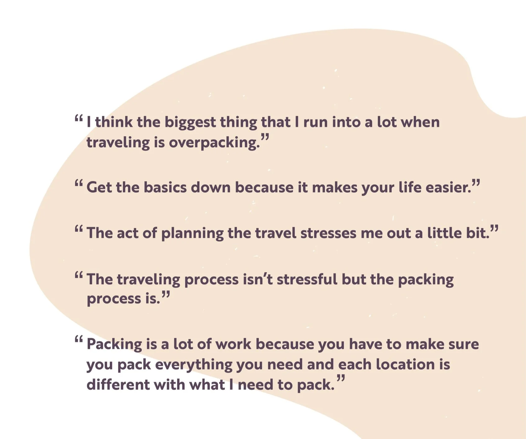
Design is deconstruction and reconstruction, but many steps below the surface make it a complex and user-centered medium. The purpose of this project is to create a brand new product experience by conducting and analyzing design research, figuring out the needs and behaviors of users, and addressing them. We first generated our topic space, which is traveling, and then we interviewed 16 people with questions related to traveling. Based on their responses, we narrowed down the specific issue we wanted to focus on. We then created an app addressing the issue to fulfill the users’ needs and behaviors.
Research
Brainstorming
After researching the users’ needs and behaviors, we brainstormed a list of five potential product experiences we felt addressed the different issue we learned based on the responses from interviewees.
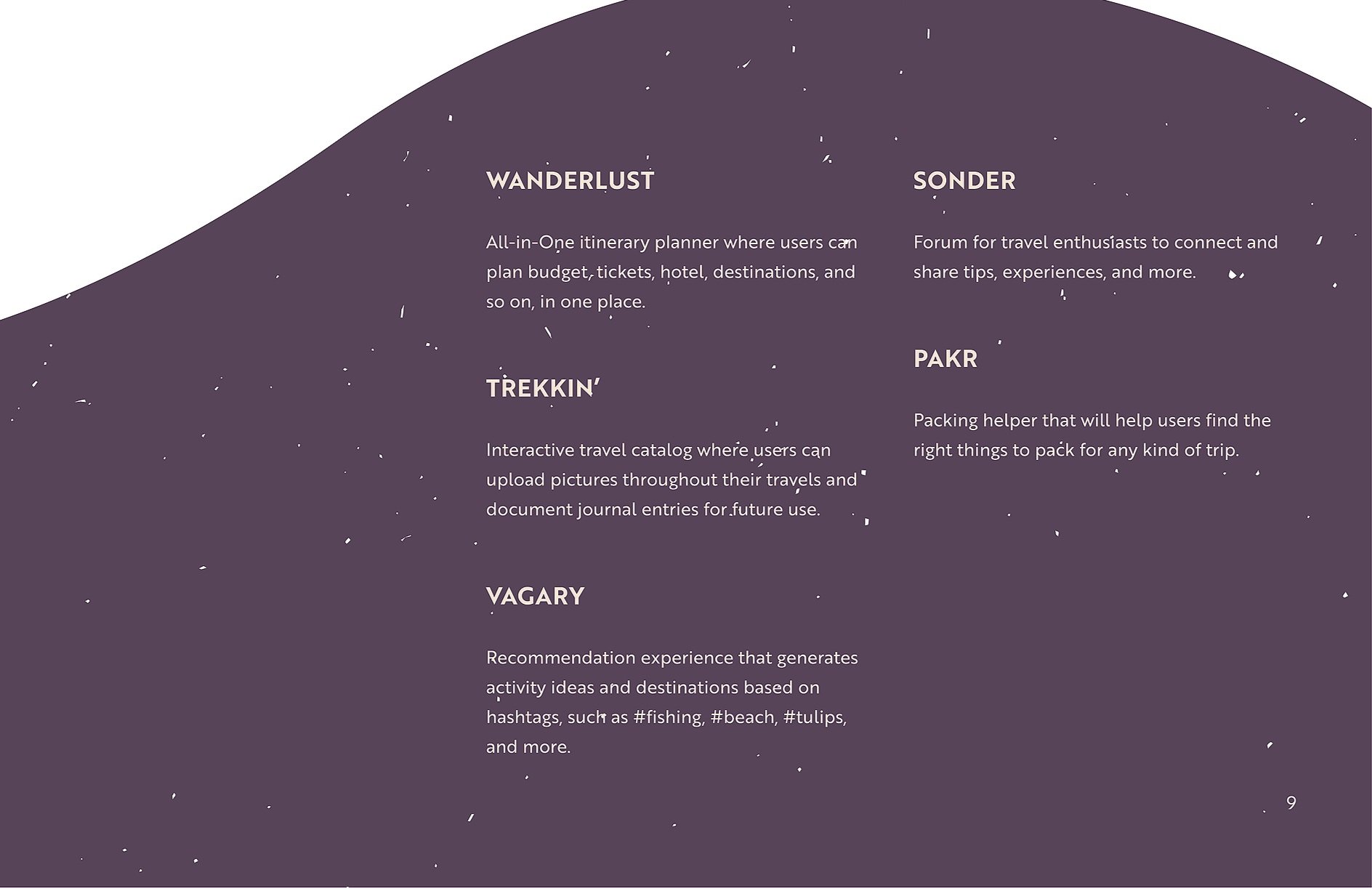
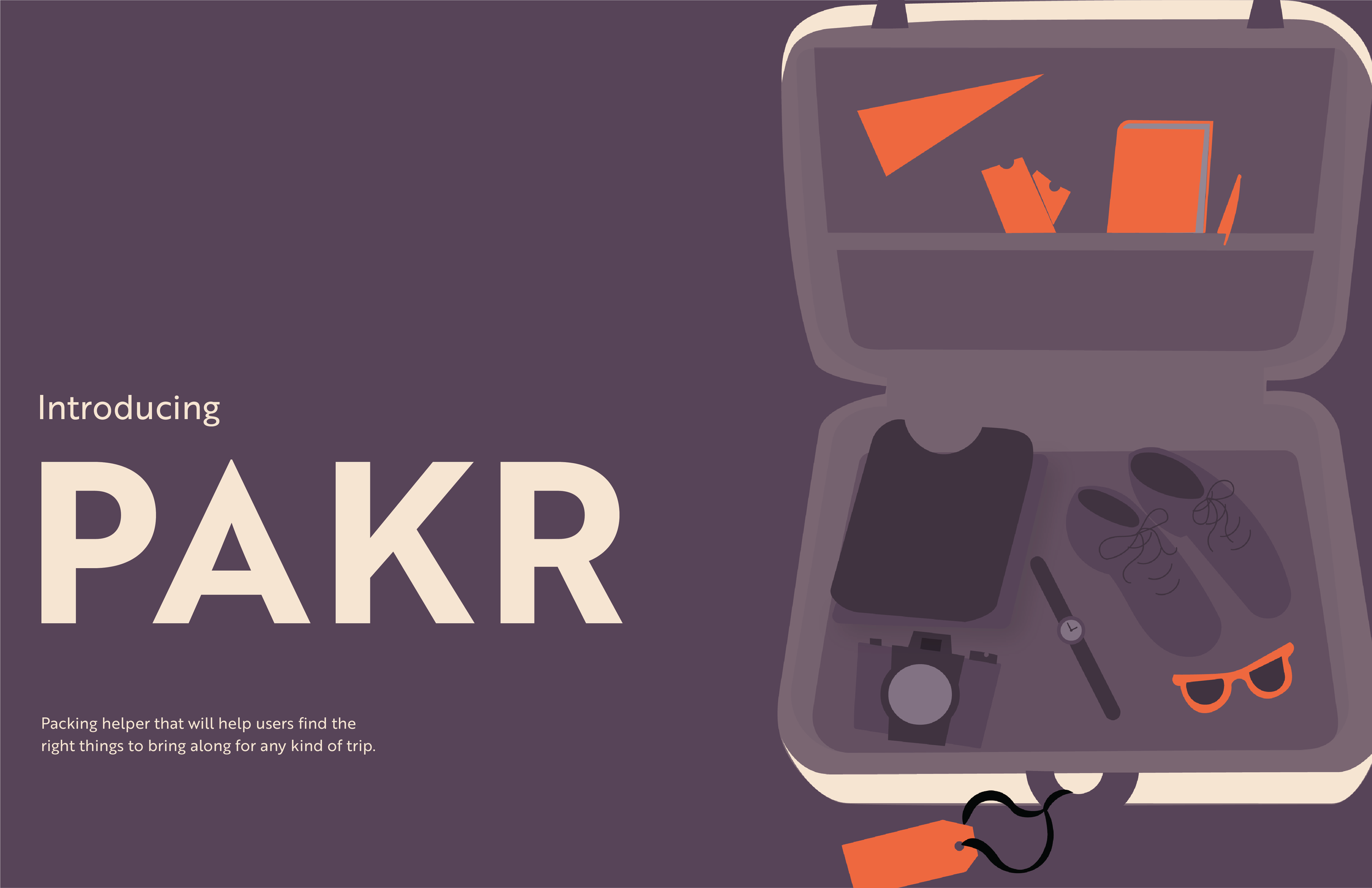
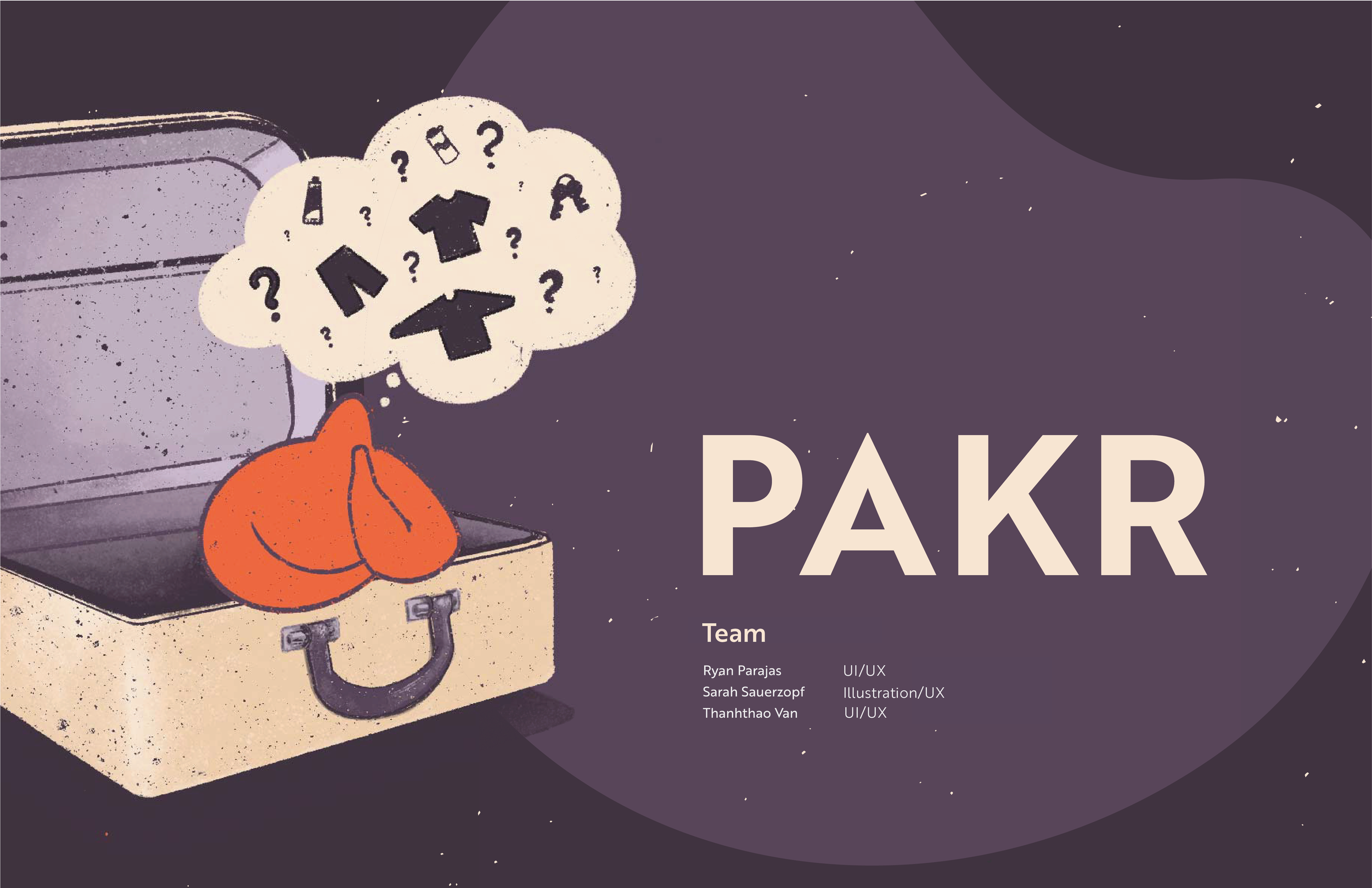
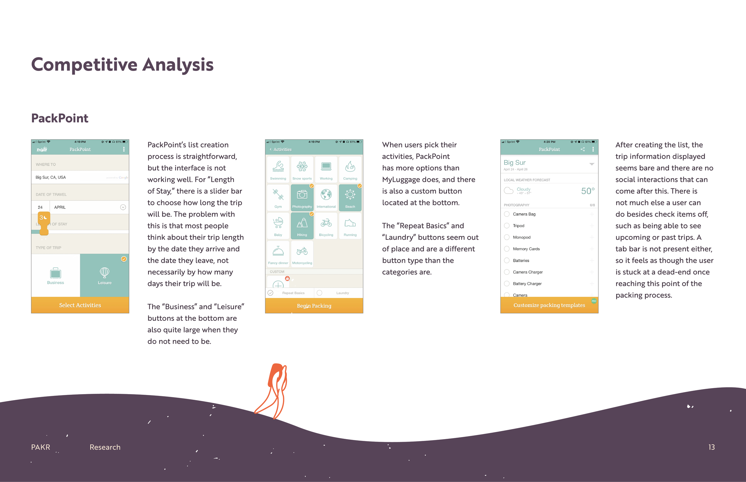
PAKR
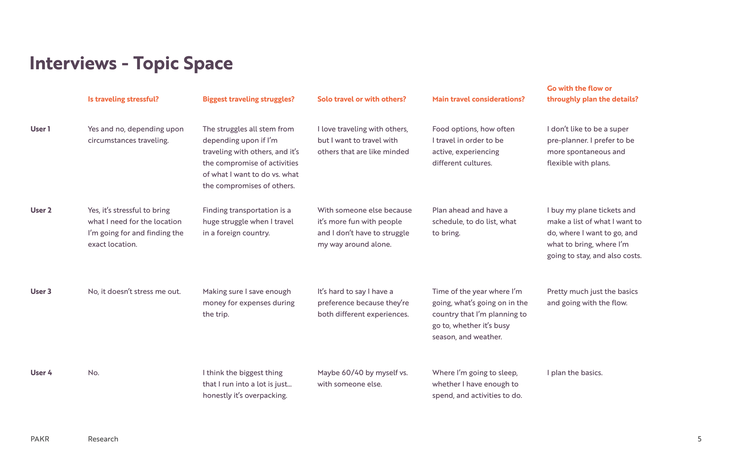
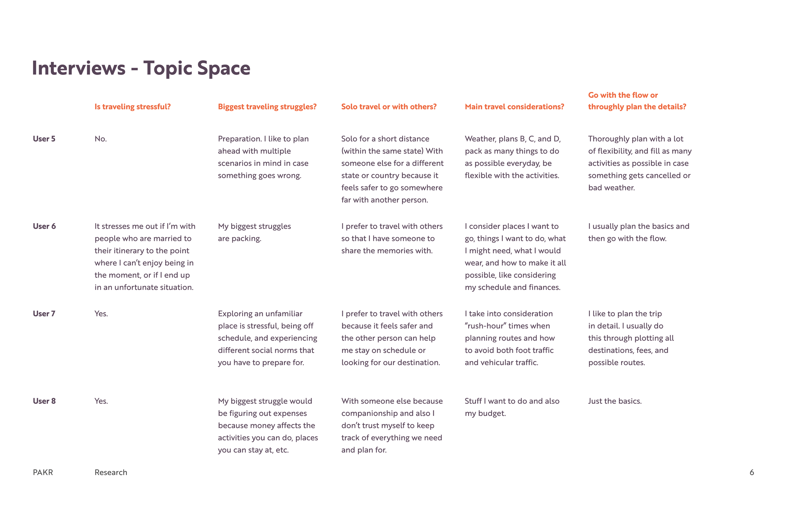
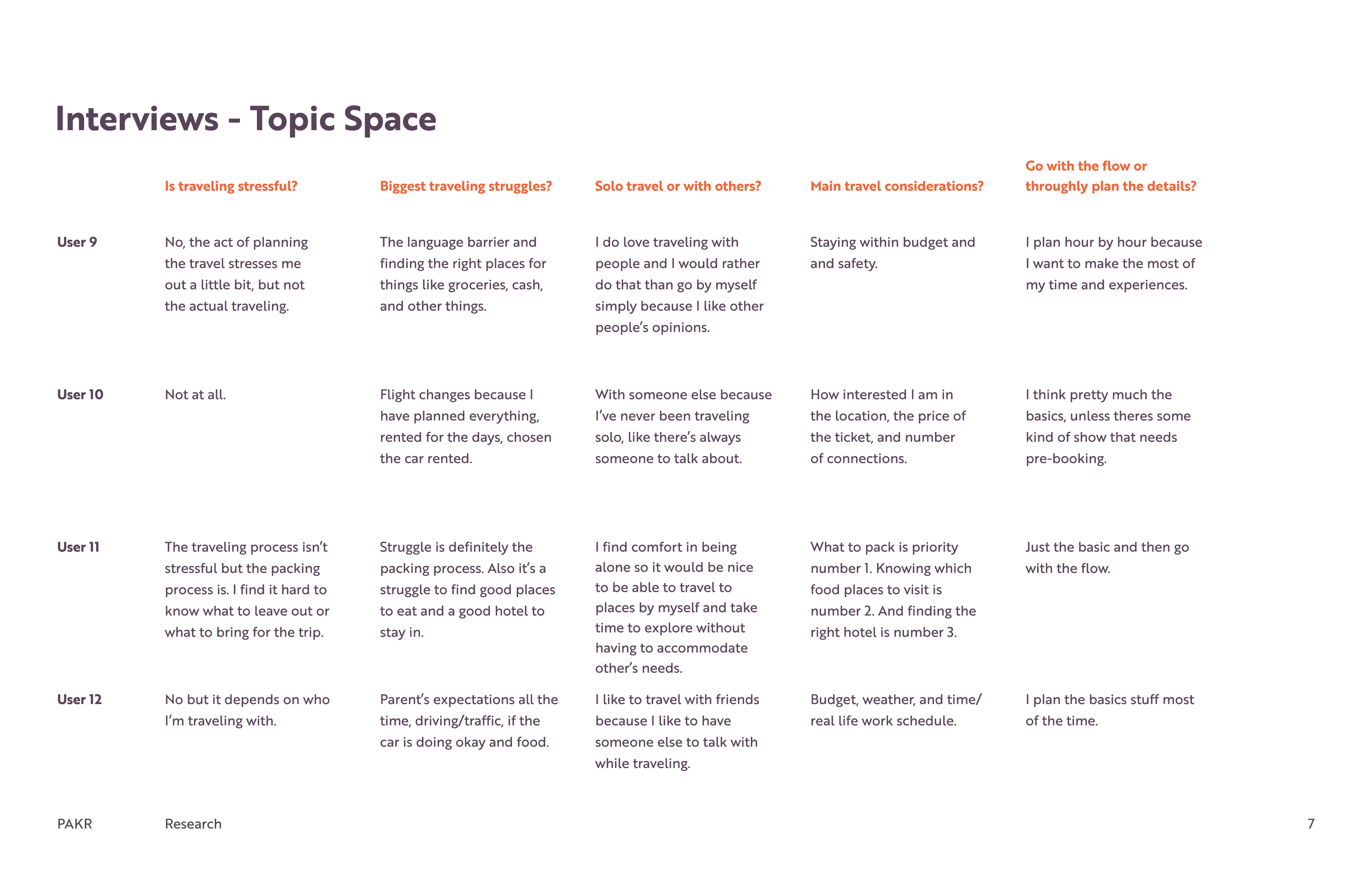
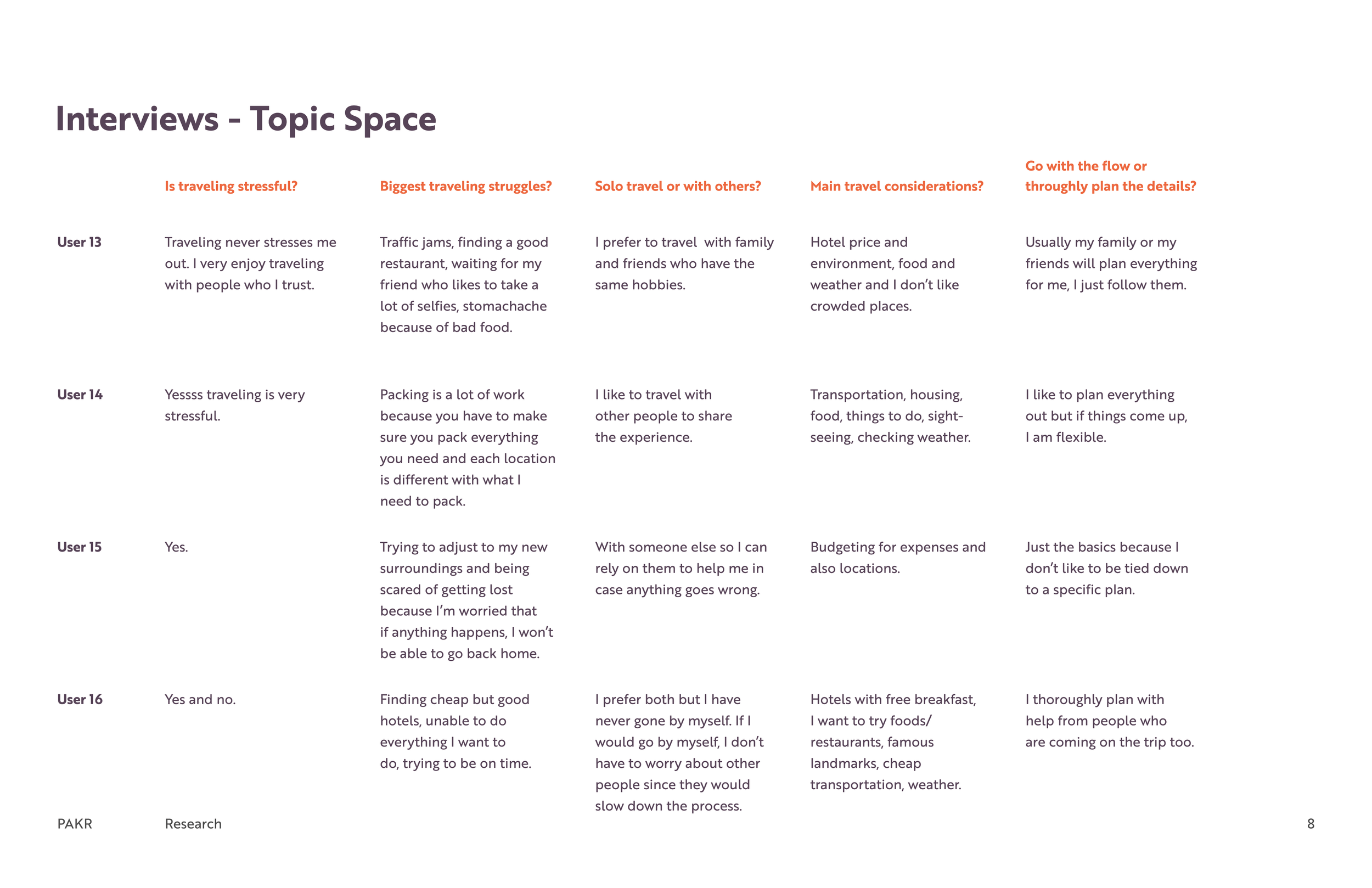
If you’ve ever struggled in any way relating to packing and being prepared for trips, PAKR is the app for you! Ultimately, we enjoyed the idea of PAKR the most because of its potential for diversity. Although it can be seen as a fairly simple product on the surface, it is quite a vast idea because we can take into consideration things like weather, activity, destination, types of accommodations and transportation, and so on. Our interviewees mentioned their struggles with packing, whether it be under or over-packing, not knowing what to pack, and other related issues, so we felt that creating a great packing experience is something that will improve the traveling process and reduce stress for our users.
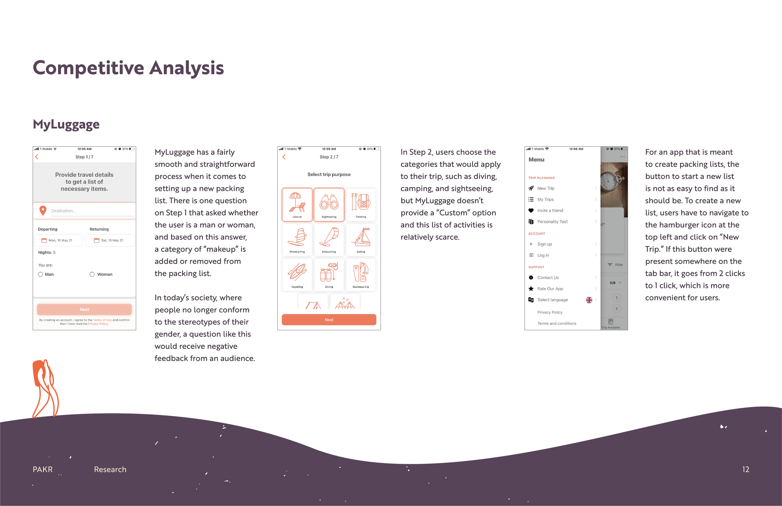
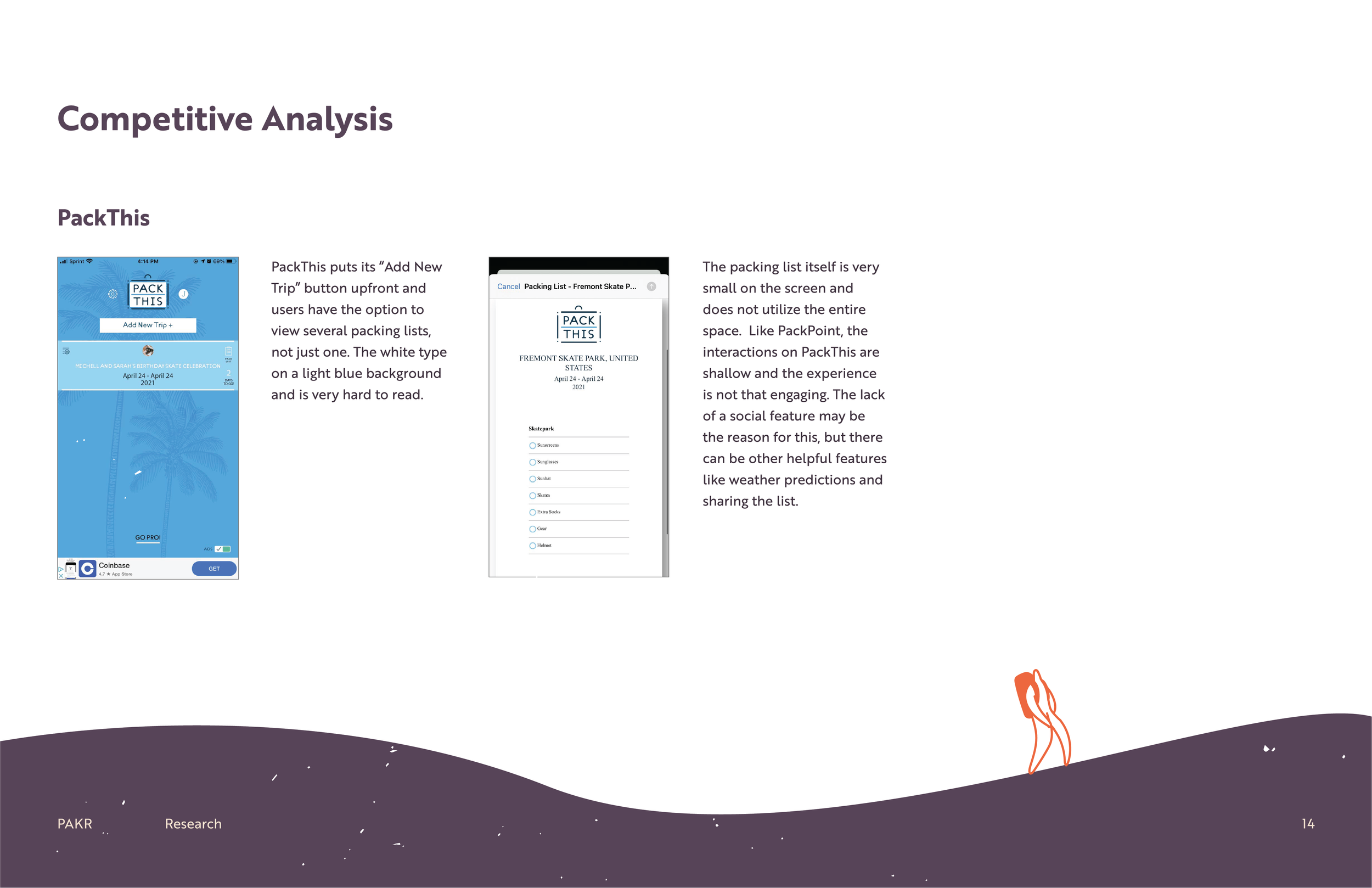
Competitive Analysis
Storyboarding + Illustrations
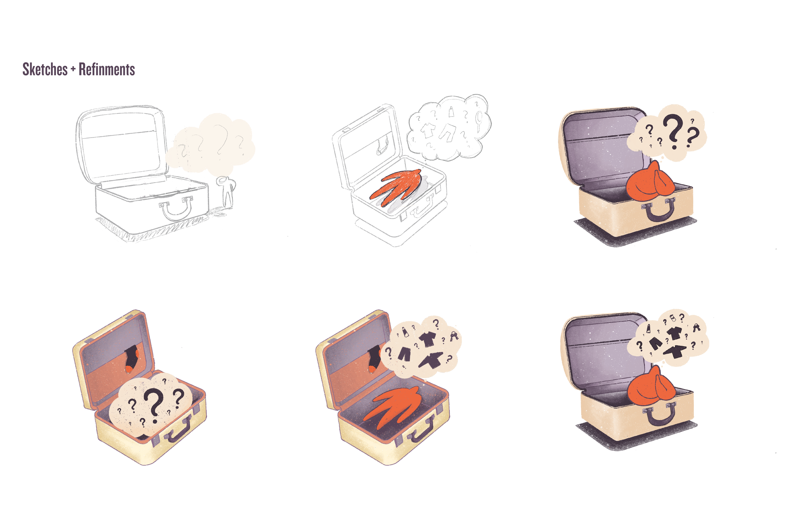
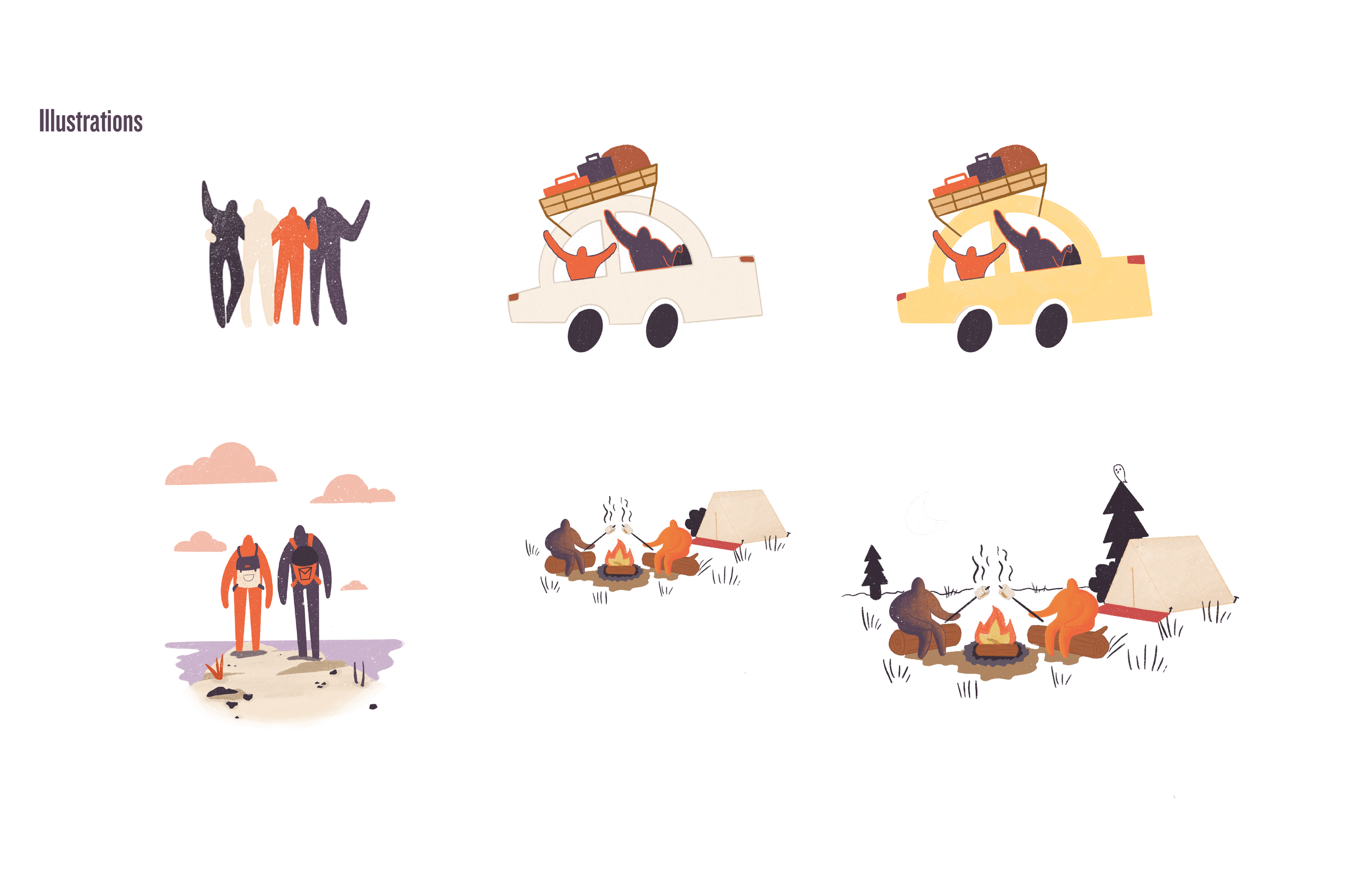
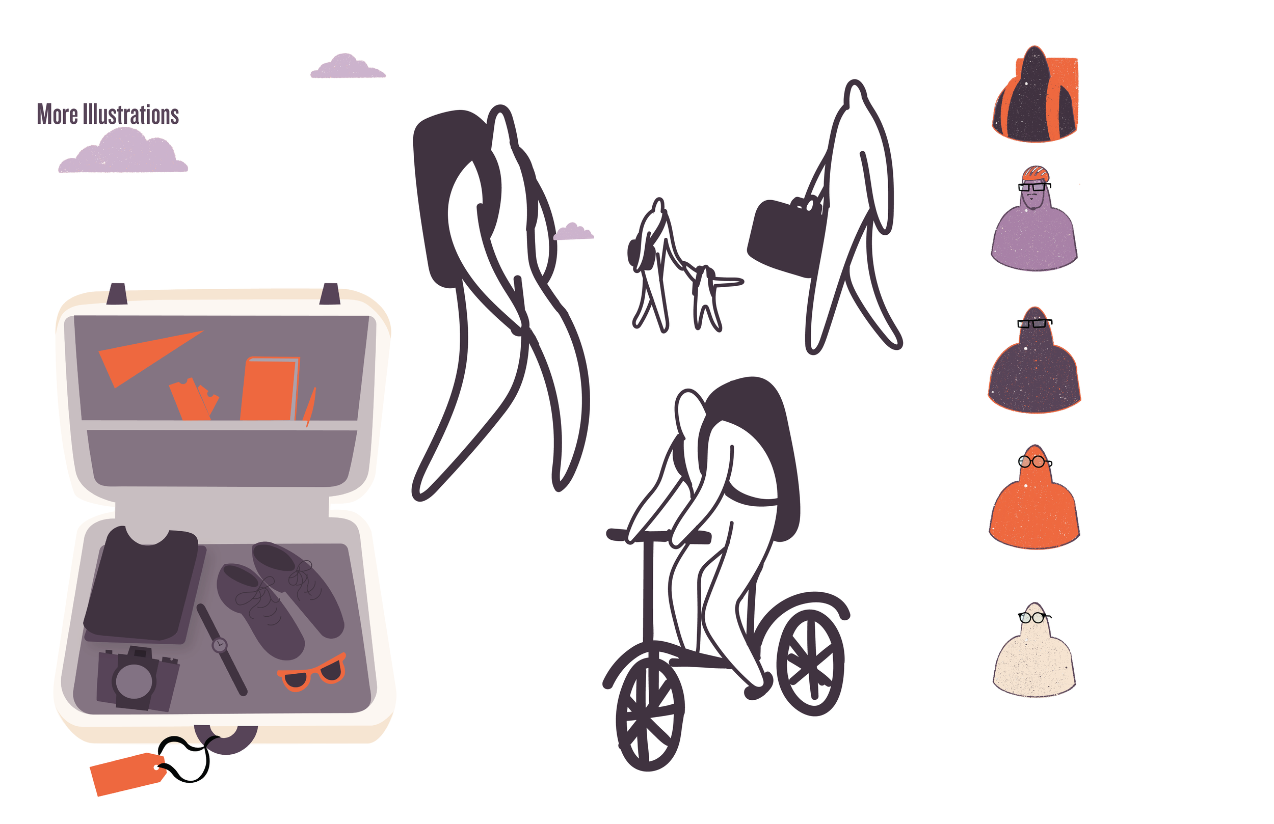
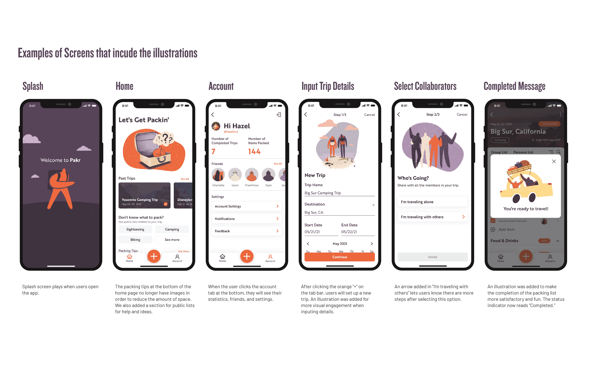
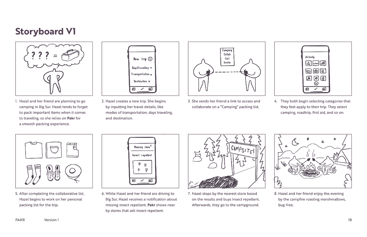
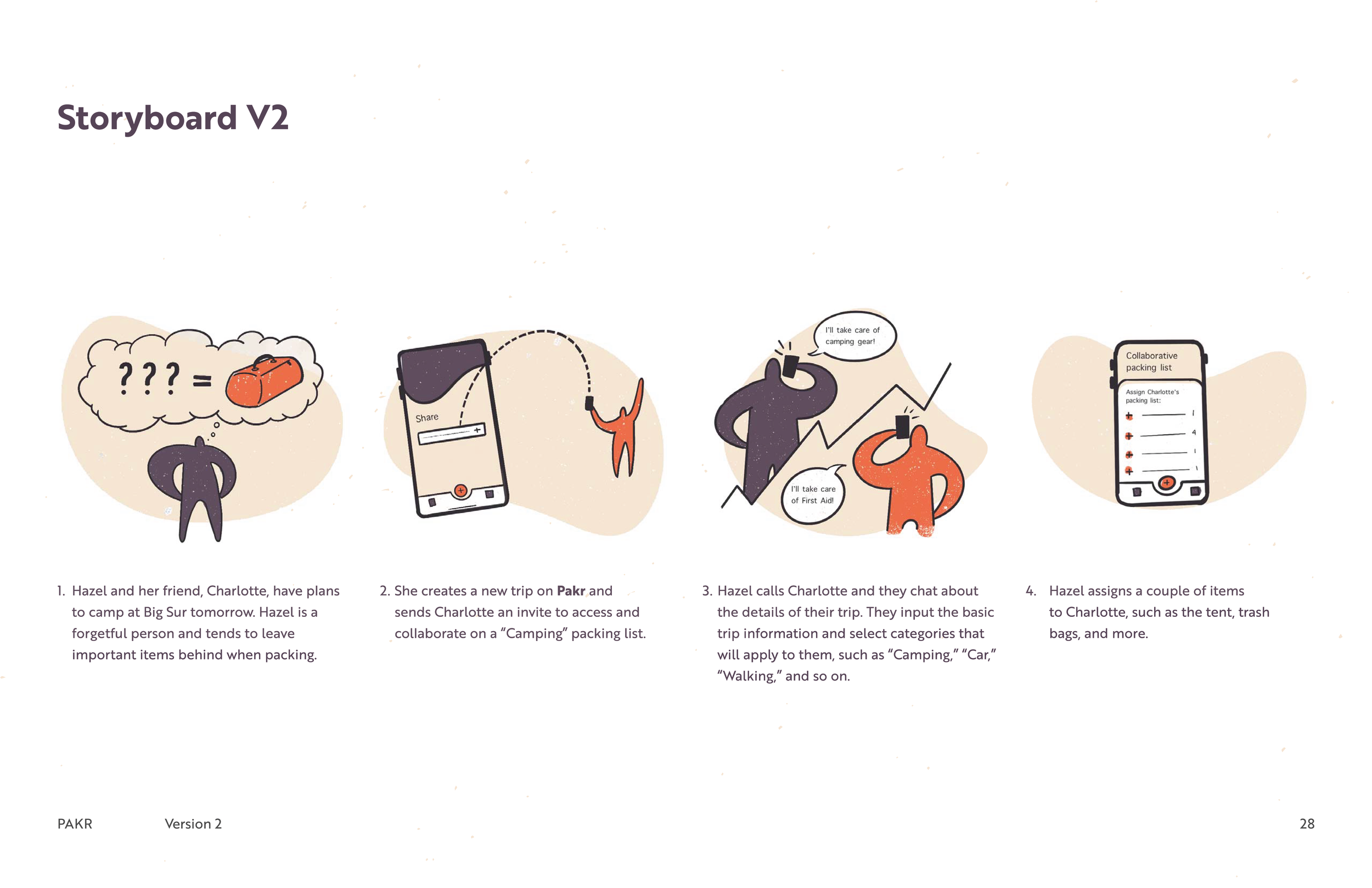
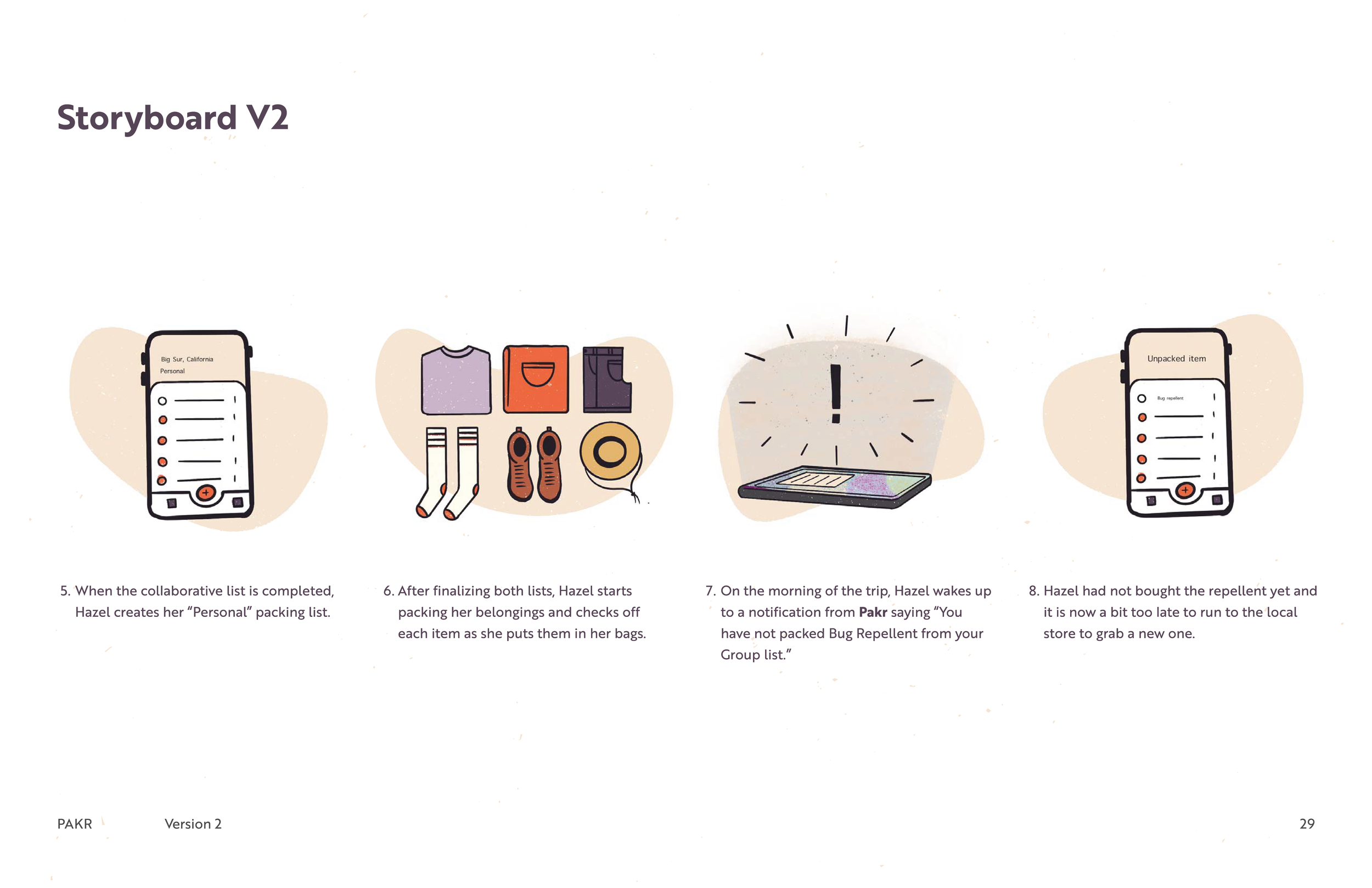
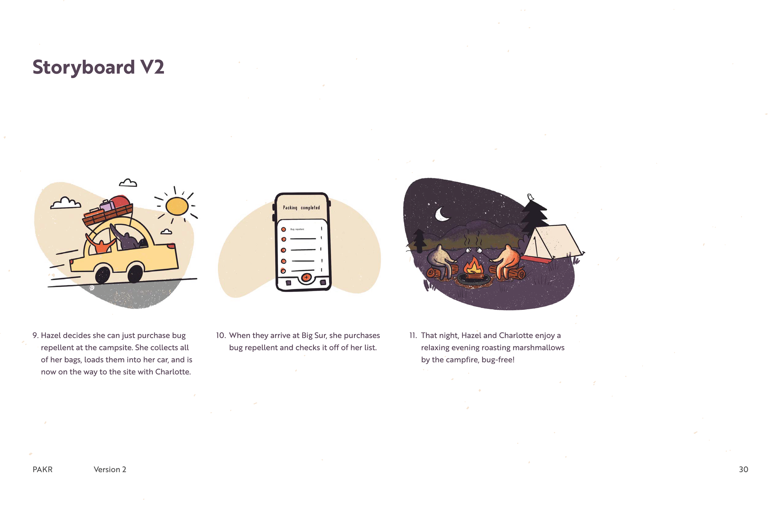
In my team, I was assigned to create illustrations for PAKR. I started my illustrations with Storyboarding just to get a better understanding of what PAKR would do in a situation with the user. Although it is very sketch-like, I tend to gravitate towards this style of illustration even if it’s in the brainstorming stages. Once we felt that the user's story made sense, I added our color palette, and textures, and cleaned up the outlines. Since my team liked the way I illustrated the storyboard, it ended up being the influence for the illustrations in the rest of the application.
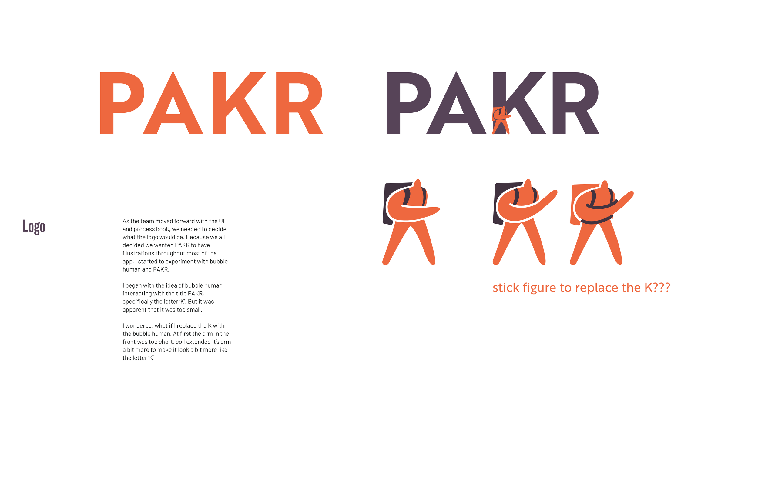
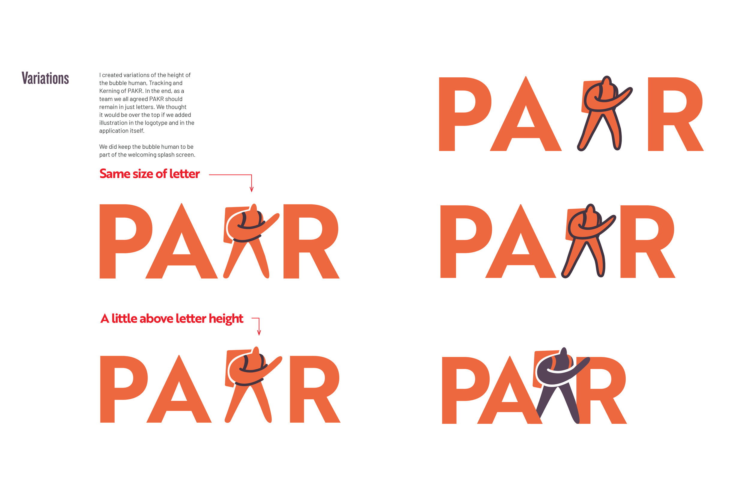
Logo
As the team moved forward with the UI and process book, we needed to decide what the logo would be. We all decided we wanted PAKR to have illustrations throughout most of the app, I started to experiment with bubble human and the title of the brand. I began with the idea of the bubble human interacting with the letters in PAKR, specifically the letter ‘K’. But it was apparent that it was too small. I wondered, what if I replace the K with the bubble human? At first, the arm in the front was too short, so I extended its arm more to make it look a bit more like the letter ‘K’.